 Optimist Consulting
The word was ‘candy’
A consultant named Beatrice Santiccioli had flown in from Milan, and instead of a binder of plastic chips she carried something stranger: a rack of test tubes, each filled with food-colored water. Those tubes were the color standards. The brief they represented came down to a single word — candy. Apple didn’t want a computer that looked like a computer. They wanted something you’d reach out and touch.
I’ve been thinking about those test tubes again lately. A recent conversation for the Design in the Wild webcast turned to the iMac, and it struck me how much of that machine’s success rode on a decision most people never think about: its color, its material, and its finish. In the trade we call that CMF — Color, Material, Finish. The iMac is one of the purest CMF case studies I know of, and I had a ringside seat — some people called me an “observer” — in the Color Lab where its colors were developed.
Apple’s make-or-break moment
It’s easy to forget now, but in 1998, when all this was taking place, Apple was in real trouble. The iMac was not a victory lap; it was a major bet the company was making. And the thing that made people fall for it was not the processor or the price — it was how it looked. Translucent, glowing, approachable, with a handle that quietly said, you can pick me up, you’re allowed. The industry had spent decades making putty-colored boxes that looked exactly like each other. Apple made something you wanted to show off on your desk.
That is the part of the story I lived: the shift from opaque to translucent shells, and the chemistry that made it possible.
Solving Bondi Blue
By the time our team got deep into it, the original color — Bondi Blue, the one I still think of as Petrol — was already heading into production. But there was a problem. Steve Jobs looked at the shells and didn’t like the edge: the blue went too dark, almost muddy.
This is where a colleague of mine, Todd Curtis, earned his afternoon. Todd had experience formulating colors in our sheet-technology group and was called over specifically to take a swing at the Bondi Blue issue. His proposal was elegant: a very small amount of optical brightener added to the color formulation. An optical brightener is a dye molecule that absorbs invisible UV light and re-emits it at visible wavelengths; in effect, it sends more visible light to the eye than actually falls on the object, making the color look brighter. Todd’s argument was that at such low levels it would cause no problems — the same brightener was already used in the translucent whites you see in backlit signage, and it was plenty stable. He was right. Apple loved the result. As Todd puts it, he was “a big hero that day.”
Why dyes, why polycarbonate
The translucency people loved was not a coating or a tint sprayed on afterward — it was the material itself. Two choices made it work. First, polycarbonate rather than a PC/ABS blend: PC provides the clarity and light transmission that make a shell glow, and it brings the impact resistance, flame retardancy, and toughness a consumer product needs. Second, the colorants were dyes rather than pigments. Pigments are crystalline; they scatter and block light, which kills translucency. Dyes disperse and dissolve into the polymer, letting light pass — exactly the effect Apple wanted.
That choice came with a catch, and it’s the kind of thing CMF work lives and dies on: dye molecules can degrade under UV light, whereas crystalline pigments are far more light-stable. So UV protection wasn’t optional — it was the price of keeping the color alive in a machine that was, after all, most likely going to sit by a window.
What made our job “interesting” was that Apple needed several variants of each color. There was frantic activity: matching the main colors and their variants, producing the colored polycarbonate pellets in sufficient quantity, shipping them to a molder in Asia, and getting the molded parts back to Cupertino — all on the fastest turnaround possible.
The 3 o’clock window
There was a ritual to the approvals. Shells were molded in Asia, air-freighted to Cupertino, assembled, and then set by a window to be judged in afternoon light — real light, not a lightbox. Jobs and Jony Ive would review them. The verdict everyone was chasing became almost a password on the project: “I want to lick that.” It sounds absurd written down, but standing there it was exactly the right test. If the color looked like candy and made you feel joy, it had done its job — instantly setting the curvy, chromatic iMacs apart from the putty-colored boxes everyone else was selling.
Apple wanted the people who made this happen close to the work. They insisted Todd be personally involved in all the customer visits at the Color Lab. Jony Ive came to the Color Lab himself — and gave Todd a watch and a commendation letter. That’s not how the plastics business usually runs, and I haven’t seen anything like it since.
From one color to a pack of Life Savers
Bondi Blue was the opening act, and in mid-1999, timed for back-to-school shopping, Apple launched the five translucent flavors — Blueberry, Grape, Lime, Strawberry, and Tangerine. A reviewer said they looked less like a computer line than a pack of Life Savers, and the name stuck. It was meant as a jab. It landed as a compliment.
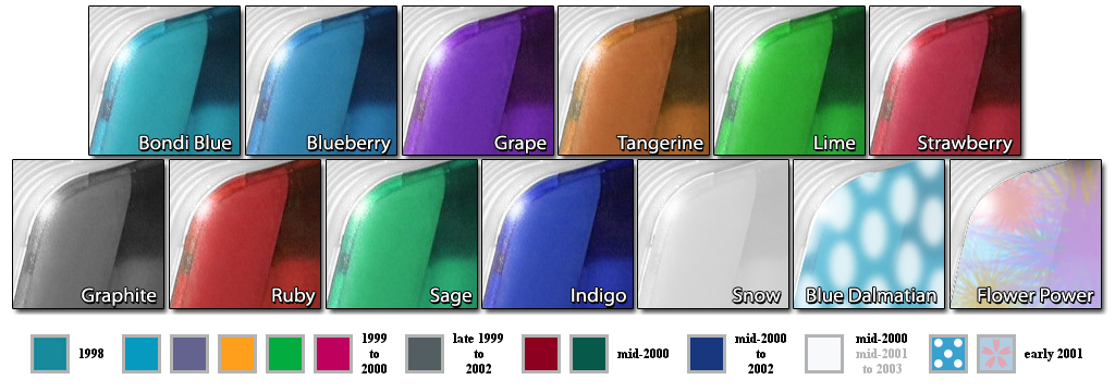
The palette kept evolving into 2000. Todd developed a deep hunter green that year; Jobs rejected it — green had flopped on an earlier Apple portable, the eMate 300, the translucent-green, Newton-based laptop Apple had built for classrooms and quietly discontinued just months before the iMac shipped. He wasn’t going back. The line closed out on three final finishes: Graphite, Sage — which, Todd notes wryly, looked an awful lot like the green Jobs had turned down — and a white variant.
Why this matters again now
Here’s why I’m telling an almost 30-year-old story in 2026. CMF trends are coming around full circle. The move that boosted the iMac into the stratosphere — opaque to translucent — is coming back into vogue across several industries today, but the pressure now isn’t only desire and the look of translucency; it’s also circularity. The same polycarbonate that had to glow in 1999 now has to be recyclable, or made from recycled content, or designed to come apart easily at the end of the product’s life. Color and material choices made at the design stage still determine what happens to a product years later — only now the stakes include whether it can live a second life, and whether the materials inside it can live even more lives after that.
That’s the throughline from candy colors to the circular-design conversations I have with clients today, and it’s the argument I keep making: bring a materials perspective in early — at the point where color, material, and finish can still be debated and end-of-life decisions built in. CMF should not be three separate problems discovered too late.